matplotlibテンプレート
matplotlibできれいにプロットするためのテンプレートを以下に示します。
import matplotlib.pyplot as plt
import numpy as np
# matplotlibの初期設定
plt_config = {
"figure.dpi": 150,
"font.size": 14,
"figure.subplot.bottom": 0.15,
"figure.subplot.left": 0.17,
"axes.xmargin": 0,
"axes.ymargin": 0,
"xtick.direction": "in",
"ytick.direction": "in",
"mathtext.cal": "serif",
"mathtext.rm": "serif",
"mathtext.it": "serif:italic",
"mathtext.bf": "serif.bold",
"mathtext.fontset": "cm",
"legend.framealpha": 1.0,
"legend.edgecolor": "black",
"legend.fancybox": False
}
plt.rcParams.update(plt_config)
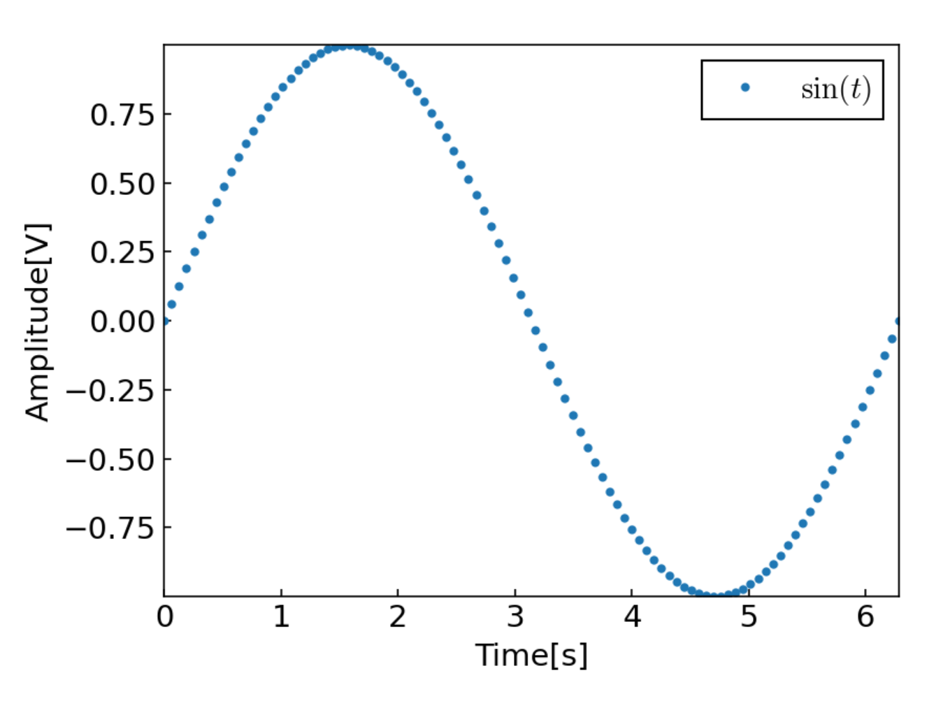
# データ
x = np.linspace(0, 2 * np.pi, 100)
y = np.sin(x)
# プロット
plt.plot(x, y, ".", ls="", label="$\sin{(t)}$")
# 軸ラベル
plt.xlabel("Time[s]")
plt.ylabel("Amplitude[V]")
# x, y軸の範囲を指定
# plt.xlim(0, 2 * np.pi)
# plt.ylim(-1, 1)
plt.legend()
plt.show()
データによって調整するべき点だけ以下に示します。
plt.plot()
plt.plot([x], y, [fmt], [ls="-", label=None])
fmt
fmtはマーカーの種類を示します。
".": 点"o": 丸"x": バツ
色も同時に指定することができます。
"b": blue"g": green"r": red
これらを組み合わせて、たとえば"ro"とすればプロットが赤い丸になります。
ls
lsはデータ点を結ぶ線を示します。デフォルトで線が表示されるので、必要なければls=""としておきましょう。
label
labelにはが使えます。数式を$で囲って、
"$\cos{(x)}$"
のように書くと、
のようにきれいな数式で表示されます。
plt.xlim()
plt.xlim(left, right)
plt.xlim()とplt.ylim()は描画するデータの範囲を指定しています。デフォルトではデータの最小値と最大値に設定されているため、必要があれば変更してください。